Image-top card
Use fixed aspect ratios for aligned card grids.
The Luminor design system is built for long-lived applications with strict correctness and consistency requirements. Use this page as the production source of truth for tokens, component states, and composed interface components.
Use semantic classes and shared templ components instead of one-off utility stacks in page templates.
All interactive patterns require visible focus, sufficient contrast, and predictable semantics.
Build pages from atoms, molecules, and organisms so teams can evolve the UI without visual drift.
Primary
Accent
Stone
Use `lmn-card`, `lmn-button-*`, and `lmn-form-*` primitives to enforce spacing and radius rhythm.
Use semantic wrappers (`lmn-card-hover`, `lmn-stat-card`) for hover and elevation instead of custom shadows and transforms.
Write body copy with clear reading rhythm. Add inline semantic links such as this example link only when the destination adds value.
Secondary metadata and helper text should remain concise.
"Consistency is a product feature. A styleguide only works when implementation and documentation stay in lockstep."
Please provide a valid value.
Use for compact feature descriptions and low-density informational blocks.
Use icon-centered cards to communicate product capabilities quickly.
"The new UI language gives us consistency, confidence, and faster delivery."
- Product Team Lead
Saved successfully.
Some values need review before submission.
A critical error occurred.
Informational update for non-blocking events.
| Name | Role | Status | Team |
|---|---|---|---|
| Jane Cooper | Regional Manager | Active | Operations |
| Cody Fisher | Project Owner | Pending | Product |
Showing 1 to 10 of 120 results

Apply a dark overlay to preserve readability and contrast across image variance.

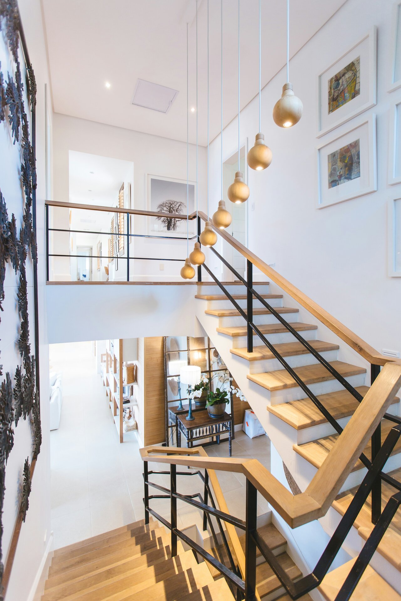
Alternate split compositions in narrative sections on content-heavy landing pages.
Use fixed aspect ratios for aligned card grids.

Suitable for inventory views and listing overviews.

Combine display typography, clear hierarchy, and explicit primary/secondary actions.
98%
Occupancy
500+
Managed Units
24/7
Support
Clear, predictable metrics with narrative context.
Consistent service quality through reusable interface components and state handling.
Components scale across modules and teams without style drift.
"The styleguide let us scale new features without visual inconsistency."
- Engineering Manager
"Design reviews are faster because every component state is documented."
- Product Designer
Treat this styleguide as the implementation contract between design, engineering, and QA.
Tenant communication, AI triage actions, scheduling, and resolution updates in one thread.
The heating stopped working overnight. It is very cold and we have a small child. Please help urgently.
Automatically classified as urgent maintenance and raised case priority based on risk signals.
Prepared empathetic response with immediate ETA, temporary safety guidance, and follow-up commitments.
Technician slots fetched: 10:00-12:00 (recommended), 14:00-16:00, tomorrow 08:00-10:00.
Water is dripping from the bathroom ceiling and getting worse.
Mapped unit relationship and linked 3A as potential source. Triggered parallel notification.
Temporary repair completed. Permanent fix scheduled after replacement part arrival.